Blood Donation App
Role : UX/UI Designer
Time : 2 weeks
Tools : Figma
*
THE PROBLEM
People want to help — but the journey of being a regular blood donor is often full of friction. There's no simple, motivating way to track donations, understand impact, or feel part of a larger mission. The challenge was to
create a mobile experience that helps donors track their progress, feel valued, and stay motivated without relying on pressure or competition.
THE PROCESS
DISCOVERY

DESK RESEARCH
To understand the space, I conducted a thorough review of 16 apps — including 7 related to blood donation and 9 gamified apps from other verticals — as well as a scan of social campaigns promoting donation.
I focused on:
What motivates users to donate regularly,
How gamification is used (or misused),
What UI/UX choices help build trust and engagement.
Key insights:
Gamification must be supportive, not competitive.
While points and badges can motivate, health-related apps benefit more from personal progress tracking than from competition with others. This shaped how I designed user milestones.
Social impact is the real motivator.
Users are more emotionally engaged when they see how their donation helps real people — not just statistics. Features that showcase the impact foster a sense of purpose and belonging.
Clarity and simplicity win with Gen Z.
Visually busy or overly medical designs reduce engagement. Users respond best to calm, clear, and emotionally intelligent design.
IDEATE
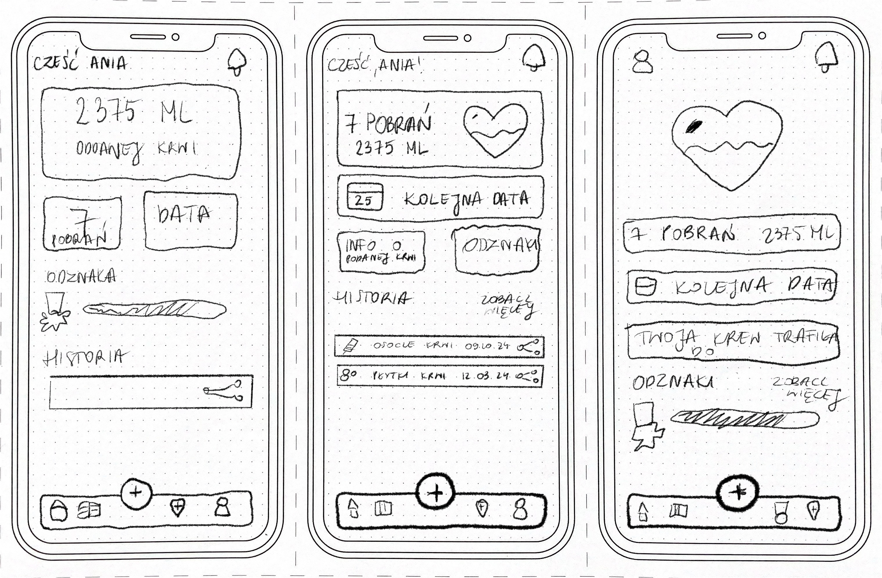
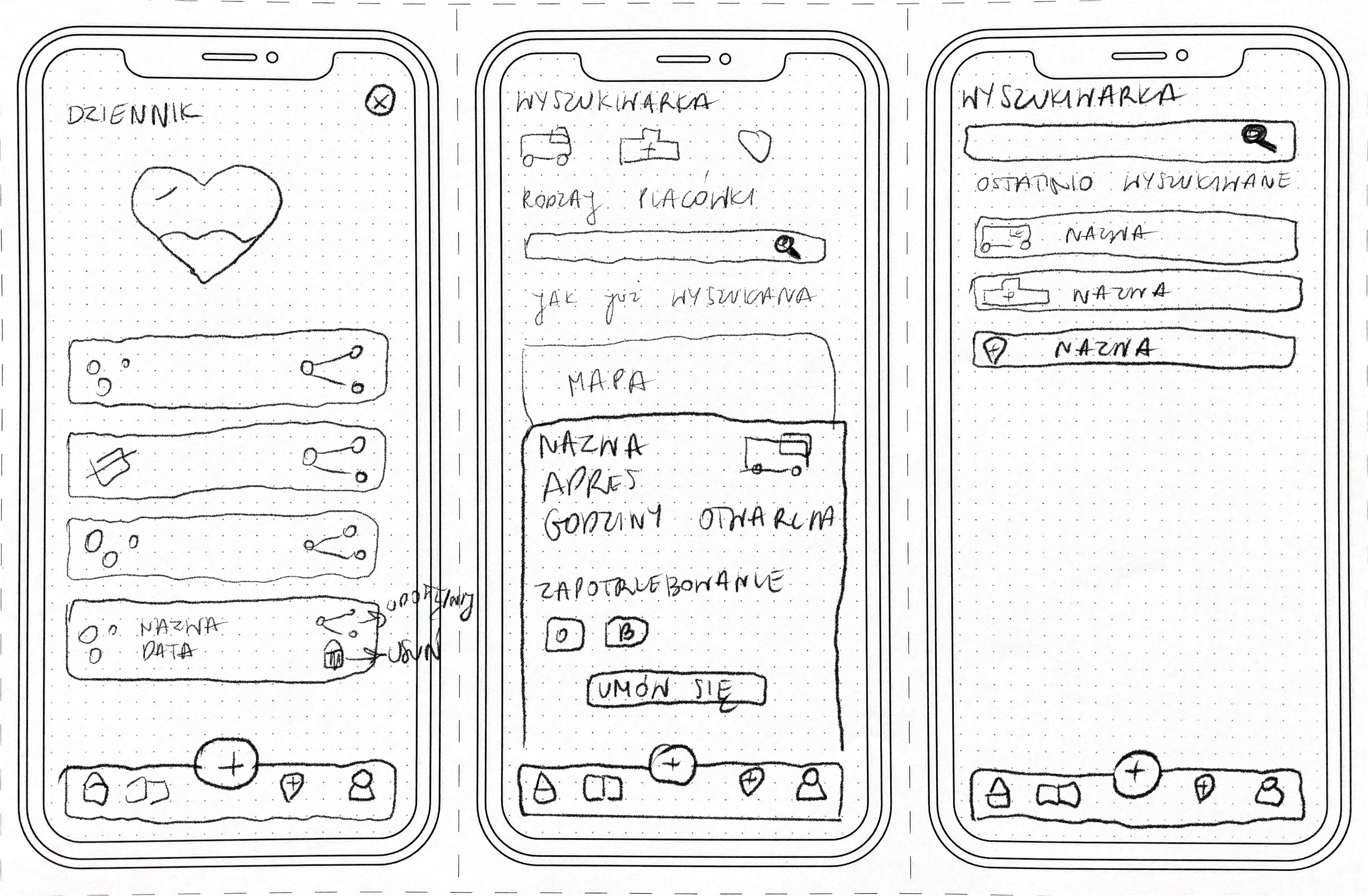
PAPER PROTOTYPING
In this early stage, I sketched flows and layouts to explore how users might move through the app. My goal was to ensure they could:
Quickly check when they can donate next,
See how much blood they’ve donated,
Understand their impact,
And feel recognized through gentle gamification.
This helped establish the app’s core structure and prepare it for early user testing.
TESTING
GUERILLA TESTING
I conducted 15 quick usability tests with 5 users using a low-fidelity prototype to uncover friction points and hidden needs. Their honest feedback directly shaped the next iterations.
What worked:
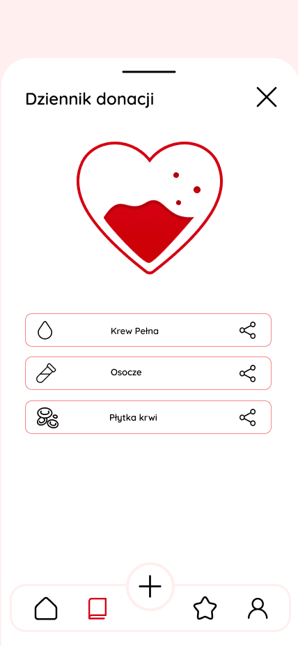
Users praised the simplicity of navigation and appreciated how easy it was to find donation history and key actions.
They were drawn to the visual elements showing the amount of blood donated and the number of lives impacted.
What users said — and how I solved it:
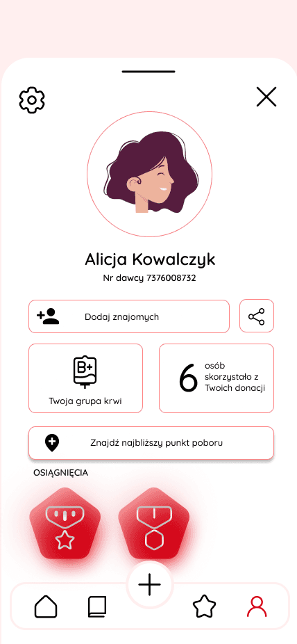
"The profile tab is too cluttered."
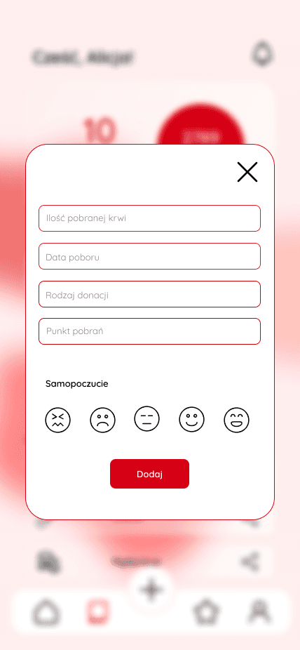
Users found it overwhelming and weren’t sure where to focus. I split the profile tab into sections, reduced text density, added white space, and used visual progress components to make information more digestible.
"I don’t need to search locations — I always go to the same place."
Users were more interested in when they can donate again and what happened to their last donation. I removed the location search altogether.
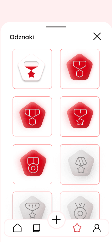
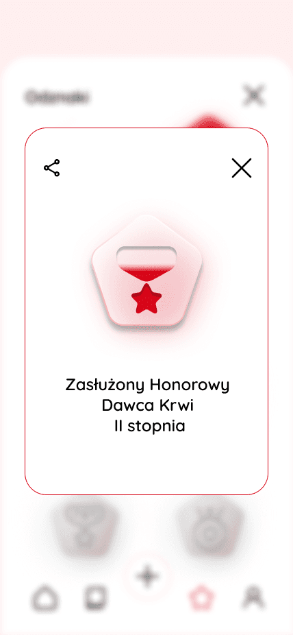
"What badges can I earn? How many are left?"
Gamification was motivating — but only if users understood their path. I redesigned the Badges tab to show:→ Earned badges,→ Progress bars for in-progress badges,→ Locked badges with clear hints. This made achievement feel encouraging, not mysterious or frustrating.
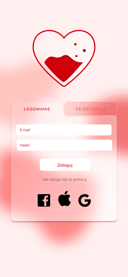
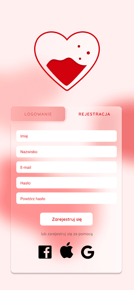
DESIGN
HIGH FIDELITY WIREFRAMES
The visual direction aimed to feel friendly, optimistic, and human, without leaning into the sterile feel often found in medical contexts.
Design Highlights:
Color palette: Warm, energetic reds used sparingly to highlight impact; balanced by soft neutrals to keep focus and calm.
Typography: Round, legible typefaces for a friendly and accessible vibe.
Micro interactions: Soft animations on donation milestones and badge unlocks added joy and encouragement.
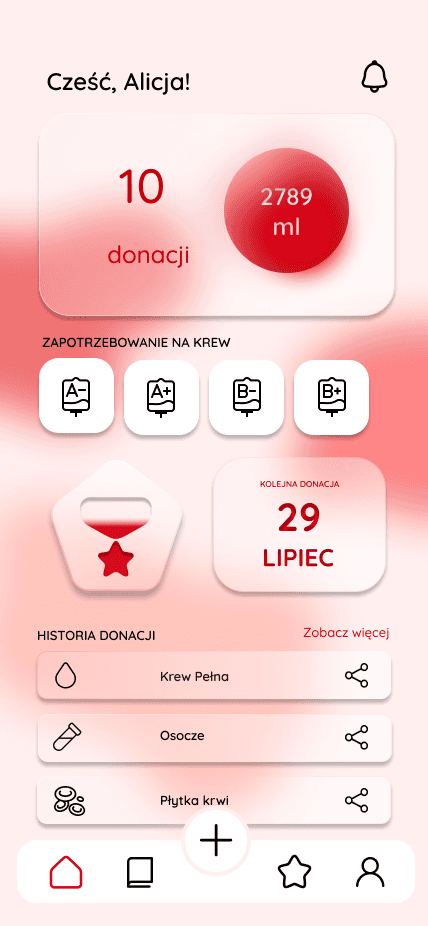
Layout: Minimalist card-based components, with priority given to:
Next donation date
Total liters donated
Lives impacted estimate
Progress toward next badge
No appointment booking was included, as the app’s focus is entirely on tracking, educating, and motivating — not logistics.
Project was done during the Fullstack UX/UI Designer Course
*
This project was all about creating a space that supports and celebrates blood donors — without pressure, without competition. From the beginning, I focused on designing a product that motivates through meaning, not metrics. At every step, I aimed for emotional resonance and ease of use — designing not just an app, but a quiet companion in someone’s donor journey. Something that reminds them: “you did something good — and you can do it again.”